Colour, fonts and imagery
Colour
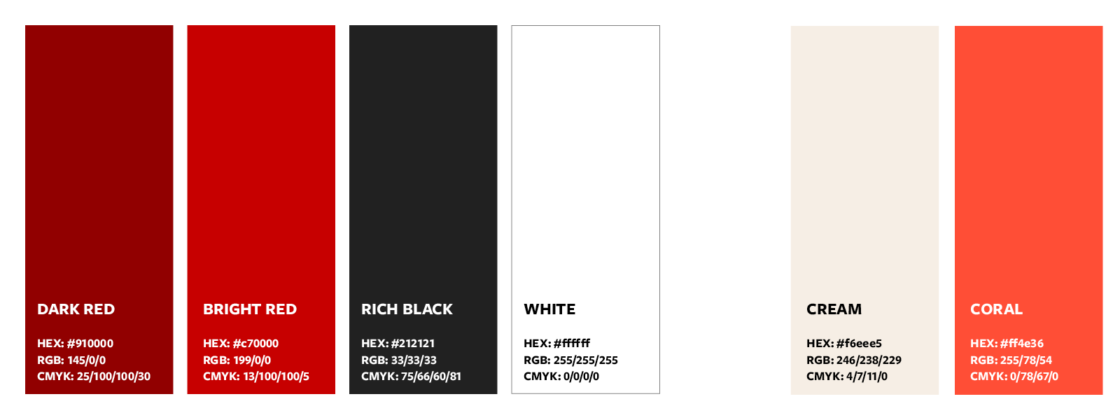
Core colour palette
Our core colour palette underpins the University corporate style. The colours can be used on materials such as signage, uniforms and livery. Using the core palette helps maintain consistency and cohesion in the presentation of the University.
| Dark red | Bright red | Rich black | White | Cream | Coral | ||
| HEX | #910000 | #c70000 | #212121 | #ffffff | #f6eee5 | #ff4e36 | |
| RGB | 145/0/0 | 199/0/0 | 33/33/33 | 255/255/255 | 246/238/229 | 255/78/54 | |
| CMYK | 25/100/100/30 | 13/100/100/5 | 75/66/60/81 | 0/0/0/0 | 4/7/11/0 | 0/78/67/0 |
Dark red
Dark red is the default, priority colour to use across executions, it presents a depth and tone that reflects the heritage and prestige of the university. Dark red and rich black are the core colours on which to feature our logo unless featured on white or cream.
Bright red
This secondary red can be used to complement the primary dark red. It brings vibrancy and energy to the palette but should be used in less volume than the primary dark red. It is permissible to use bright red in place of the primary dark red in cases where visual impact is key, such as within digital ads.
Rich black
Black gives our logo definition and impact. Either as the background colour if the logo is white, or as the logo colour itself if used on a white, cream or light colour background.
White
White is used to achieve contrast and clarity. It is pure and definitive. White is used within backgrounds, as a text colour on dark backgrounds, and within the University logo itself.
Cream
Cream brings warmth to the palette and provides an alternative background colour to white. It can be used alongside white to give subtle contrast and depth.
Coral
The coral brings even more vibrancy and an alerting tone to the palette. Coral should be used sparingly, as an accent colour or within CTAs.
Legacy core colours
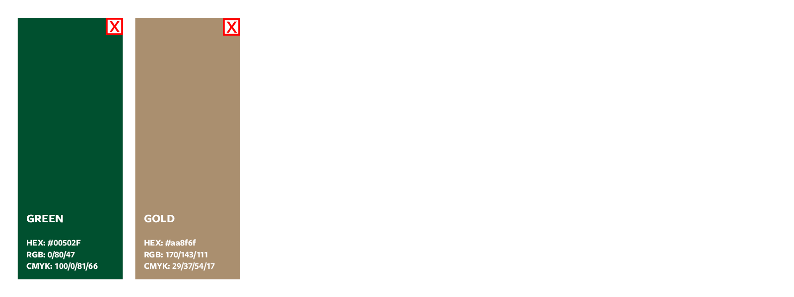
Green has been removed from the primary palette for our University identity to provide clear association of identity for the University of Leeds with the colour red, ensuring alignment with the corporate website.
If you intend to use the green, ensure there is a clear rationale for use, such as within existing green comms, campus signage or graduation ceremony material.
Gold no longer sits within the University colour palette. It can continue to appear in any legacy materials and communications, but should not be used when producing anything new, with the expectation this will be phased out completely by the end of the 22/23 academic year.
Using other colours
The core colour palette above exists to offer consistency and recognition of University of Leeds materials and communications. Other colours can be introduced into materials where required to differentiate or for a specific campaign. It is recommended at least one of the core colours is included in the palette, to ensure a visual link.
Accessibility
If you are displaying text over colour, ensure your colour contrast is high enough to pass accessibility rules. Ask your designer to check the contrast of your colour scheme before finalising it, you can check it here.
Fonts
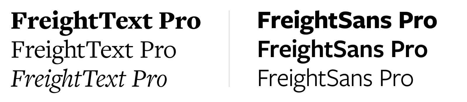
Freight Text Pro is the primary font. The character of the font is key to providing association with the University of Leeds. In cases where the black weight of the font provides challenges to legibility due to the scale of an execution, for example, a lighter weight can be used. Other weights of Freight Text Pro can also be incorporated when used in outputs, but 'black' should be established as the main lead weight.
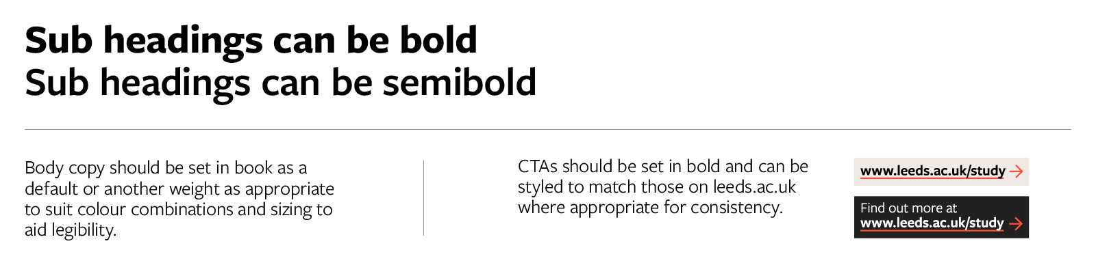
Freight Sans Pro is our secondary font. It should be used primarily within subheadings, body copy and call to actions. This font can also be used in conjunction with Freight Text Pro to give flexibility and hierarchy within content. Where fonts are combined, it's important to establish Freight Text Pro Black as the most visible and prominent font weight.
For any designs produced internally or externally, where the Freight fonts are not available, Times New Roman and Arial should be used in place of Freight Text Pro and Freight Sans Pro respectively.
Templates are available for commonly produced desktop published materials, such as internal office items and temporary signs.
Legacy fonts
Trade Gothic and Sabon are our legacy fonts, and there is an understanding these will continue to exist as we transition. Where your design is part of a wider set of assets, and needs to continue to align, you can continue to use the old fonts.
Imagery
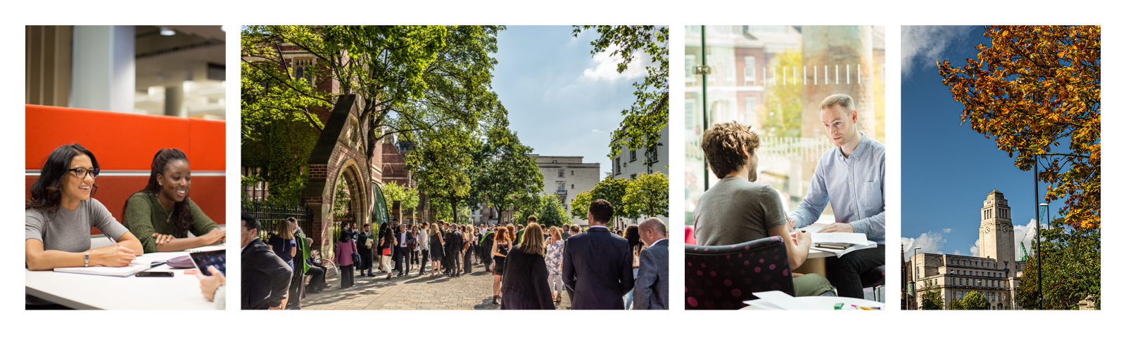
The right images also contribute to a strong visual identity. Our students and staff are at the heart of what the University does and our images need to convey that. It is important that we show the diversity of our community too.
The University image library stores our high-quality photographs, available for use across the University. The images fit with our house style and are the correct resolution (high enough quality) for print.
Read more about using and commissioning photography.