The logo

This is the University of Leeds logo. It is trademarked and designed for use across all publications. The logo is available to download in various formats from the University image library. Please include a detailed usage explanation in your request form.
There is a fixed place for the logo to appear on all materials.
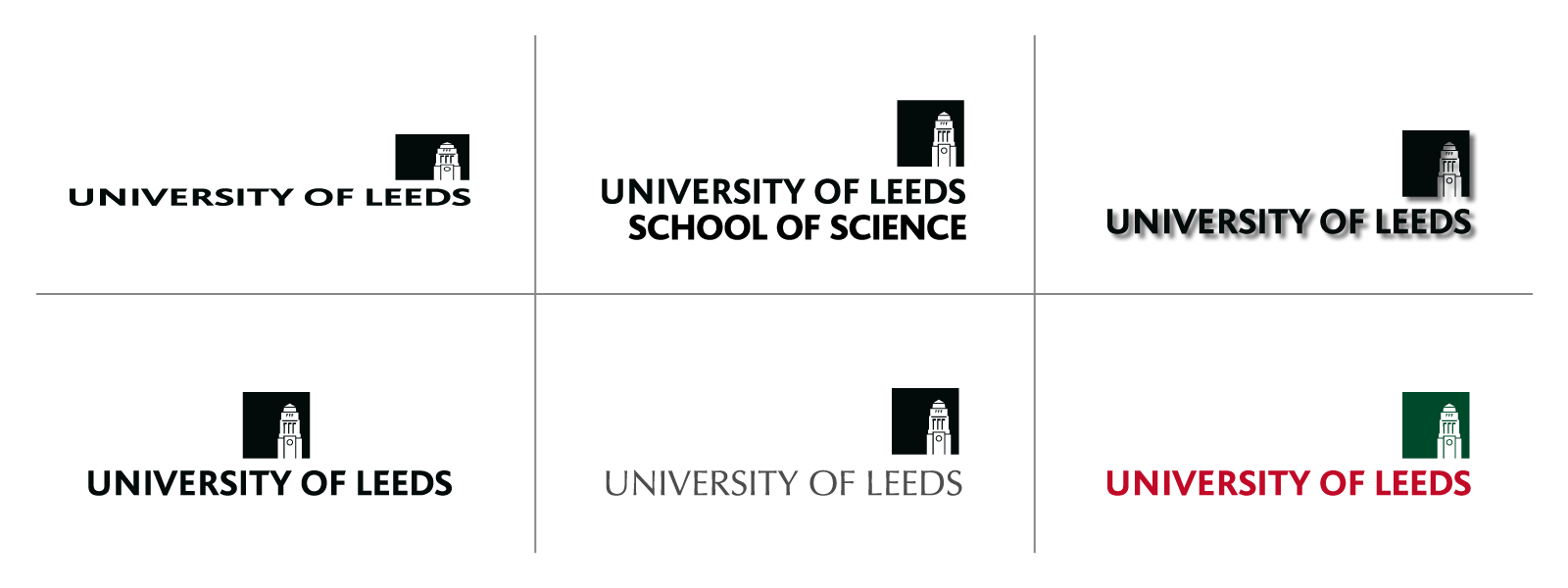
Faculties, schools, departments and services should not be identified by using individual logos. They should be identified by name. There is a fixed relationship between their names and that of the University that should be used wherever suitable.
The logo should always retain the relationship shown here. Neither the tower symbol nor the typography should be used independently of the other.
The only exception permissible is when used on social media sites as an avatar, please contact socialmedia@leeds.ac.uk for permission.
If you need further guidance, contact: commsprod@leeds.ac.uk
Common sizes
| Format | Logo width |
| A0 | 190mm |
| A1 | 140mm |
| A2 | 100mm |
| A3 | 75mm |
| A4 | 65mm |
| A5 | 48mm |
| A6 | 38mm |
| A7 | 35mm |
| Email signature | 100px |
| Display screens | Various, see this section |
| Email headers | No logo required |
| Social media posts | Various, see this section |
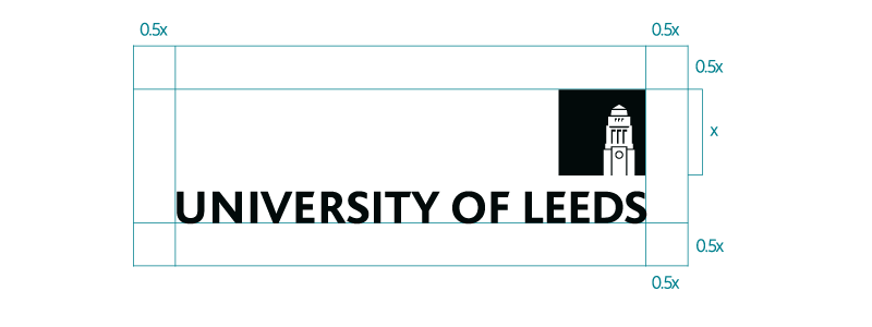
Clear space
To ensure that the University logo always appears clearly and unobstructed, it is important to provide an area of clear space around it. The minimum clear space areas are shown here. No other object should appear within this area at any time, and where possible, this clear space should be increased. The logo should maintain a clear space equal to 0.5x (half the size of the tower symbol) around the whole logo.
 Minimum size
The University logo should always be legible and must never lose its integrity when reduced to a small size. To ensure this, the logo should never appear in print smaller than 25mm wide.

Digital
When used digitally, you can use the standard University logo or if it appears less than 138px wide you can use the pixel logo, which has been adapted for legibility at a smaller size on screen. Neither the standard logo or the pixel logo should be displayed any smaller than 100px wide.

Contrast
When applying the logo over a background colour, (using only the black or white .eps (vector) format, which retains a transparent background) there must always be sufficient contrast between the logo and its surroundings, ensuring its visibility and impact. Our commitment to making our communications accessible to all means that we should always aim for maximum legibility. We expect all professionally designed materials to be fully accessible, including colour and contrast. If in doubt, use an online colour contrast checker and ensure your chosen colours pass WCAG AA standards.
Misuse
To ensure the integrity and legibility of the logo, we ask that it do not be altered or added to in any way. This is not an exhaustive list, but some examples include:
- Do not squash or stretch the logo, it’s proportions should never be altered
- Do not add elements to the logo, within the clear space outlined above
- Do not add shadows or effects to the logo
- Do not alter any individual part of the logo, including colouring the tower in, resizing individual elements, re-aligning or centering the tower, etc.
- Do not recreate the logo in any other colours, or multiple colours