Display screens
There are around 80 display screens situated on campus. There are several different sizes and orientations:
Landscape:
- 16/9 format (1920×1080px)
- 4/3 format (1096×882px)
- 2/1 format (1280×640px)
Portait:
- 2/3 format (1000x1500px)
- 9/16 format (1080×1920px)
View all display screen locations, contacts and formats across campus.
If you would like a display screen design to be sent to all screens across campus, please email displayscreens@leeds.ac.uk with the designs and details of when you’d like your designs to be live and taken down. The team aim to complete your request within 5 working days.
If you are submitting a screen it must adhere to the University’s visual identity guidelines and the guidance that follows. The best way to ensure this is to have it designed by a graphic designer on the University’s supplier framework.
Display Screen PowerPoint Templates are available to download.
Please ensure when you are emailing assets to be displayed on the screens that they are the correct size for each area and also follow any instructions provided.
Guidance for designing for display screens
- If you are including the University logo, please make sure it is included in the following sizes and formats:
- 4:3 – 1096 x 822 pixels: logo width 252 pixels, margin 37 pixels
- 16:9 – 1920x1080 pixels: logo width 330 pixels, margin 50 pixels
- 2:1 – 1280x640 pixels: logo width 235 pixels, margin 35 pixels.
- The 2:3 display screens are located in our library spaces and have the logo built in to the surround, so you can omit it from your design for this format.
- Screens are usually only displayed for a short time (8-15 seconds). When creating your screen make sure you can read the content within this time. We recommend no more than 30 words on a screen at once. A passerby may only glance at the screen for 2-3 seconds so make sure your message is clear and to the point – less is more!
- Try to use only one image (photograph or graphic) as multiple images are distracting. Make sure the image is high quality, appropriate and helps convey the message.
- Try not to overlay text on images or use low-contrast background colours, as this reduces legibility.
- The screen should have a clear title/subject and dates (if applicable).
- The screen should include a clear call-to-action (tell people what you want them to do eg attend an event).
- Avoid using long or complicated URLs. Even shortened URLs, such as http://goo.gl/3QMxEc are not advised as they are too complicated for users to remember or type in. If you cannot adjust your URL, consider alternatives such as hashtags, email addresses or search terms, which may be easier to remember.
- Don’t centralise or justify your text – it makes it inaccessible.
- Try not to put things in too many boxes – it makes it difficult to navigate the screen.
- Don’t write in capitals – this makes things more difficult to read – and don’t write vertically.
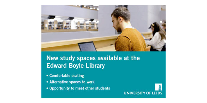
Good example
- Uses approved University typeface
- Text is left aligned
- Message is concise and on a plain background
- Spacing between elements is comfortable
- Photograph is in proportion and shows the available space in the Library
- Use of colour in the background helps the message to appear more considered and friendlier.

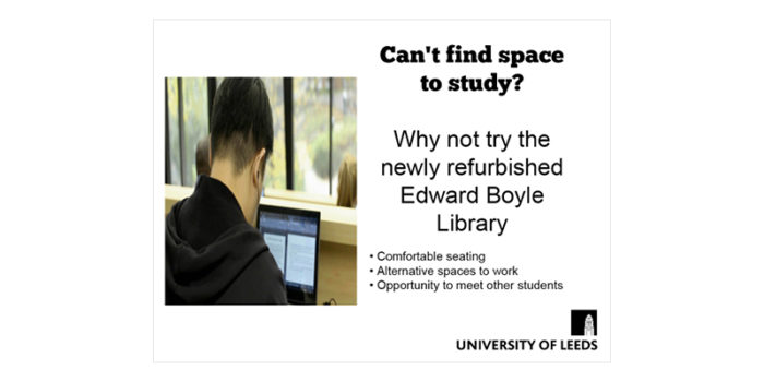
Bad example
- Heading is not in an approved University font
- Text is centralised
- Message should be more concise
- Not enough spacing between all elements
- Photograph is stretched and doesn’t convey the space available in the Library
- White background with black text appears unconsidered and harsh.

New display screens or updates to information
To register a new display screen or update any of the information we hold, please email the Communications team at displayscreens@leeds.ac.uk.
