Digital advertising
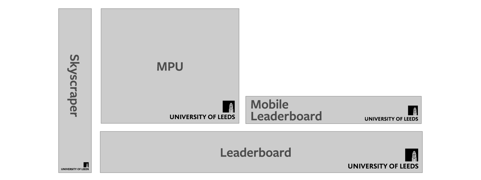
For best display you should use the Pixel logo for these digital formats, which is available to download here.
| Name | Size | Margin | Logo |
| Skyscraper | 120 x 600px | 10px | 100 x 28px |
| Wide skyscraper | 160 x 600px | 10px | 138 x 40px |
| Small square | 200 x 200px | 6px | 100 x 28px |
| Vertical rectangle | 240 x 400px | 10px | 138 x 40px |
| Square | 250 x 250px | 10px | 138 x 40px |
| Inline rectangle/MPU | 300 x 250px | 10px | 138 x 40px |
| Mobile leaderboard | 320 x 50px | 6px | 100 x 28px |
| Large mobile leaderboard | 320 x 100px | 6px | 100 x 28px |
| Large rectangle | 336 x 260px | 10px | 138 x 40px |
| Banner | 468 x 60px | 6px | 100 x 28px |
| Leaderboard | 728 x 90px | 10px | 138 x 40px |
Clear space and margins
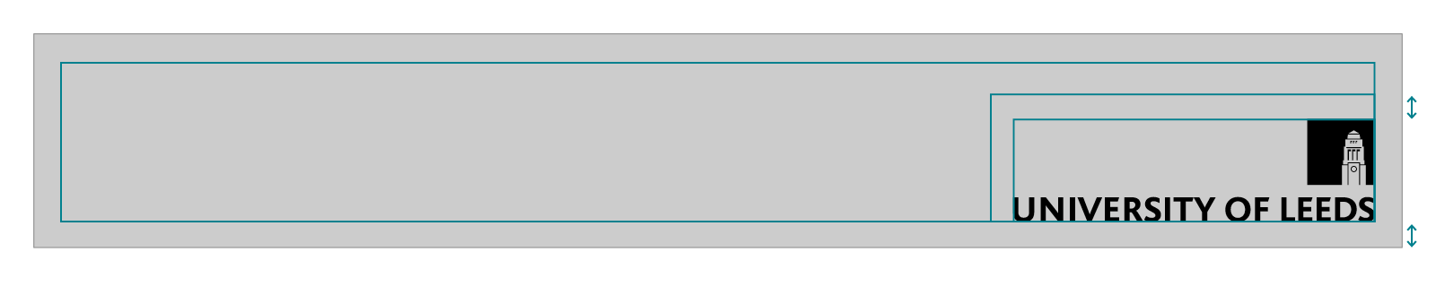
Maintain a margin around the logo equal to the margin of the banner size of either 6px or 10px.